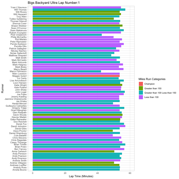
Here is an animated summary of the 2019 Bigs Backyard Ultra. Every iteration gives the time needed for each runner to complete a specific lap. The y axis shows each runner in reverse alphabetical order. The x axis gives the time needed to run each lap. You’ll notice runners dropping out over the course of the race and disappearing from the animation. The colors represent total miles each runner traverses over the course of the event. Relive the battle in real time below:
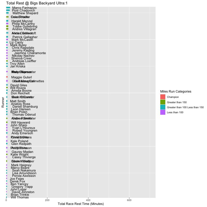
A second (more interesting animation imo) is a cumulative total by runner of time spent resting over the entirety of the event. The animation makes evident the differences in pacing strategies. As shown in a previous post, Dave Proctor not only ran at the front of the pack; he did so for a very long time. It is neat to see champion Maggie Guterl’s and runner-up Will Hayward’s steady ascent up the resting leader-board as they dueled to the finish of the actual podium.
If you are interested in making your own animated visualizations check out the R package gganimate.